The Cartographer’s Code: Trading Timeframes
Chip was hunched over his monitor, looking like a squirrel trying to cross a six-lane freeway. He was staring at a 1-minute chart, his eyes darting frantically. “Ollie, MegaCorp (MCX) just printed a monster red candle! The roof is caving in! I need to short it right now before it hits the floor!”
Ollie “The Oracle of Obvious” peered over Chip’s shoulder at the hyperactive chart. “Ah, you’re looking at the noise, Chip. You’re navigating by a close-up picture of a single cobblestone while trying to drive across a continent.”
“Cobblestone?” Chip squawked. “That cobblestone just lost me $50 in five seconds! This is a disaster!”
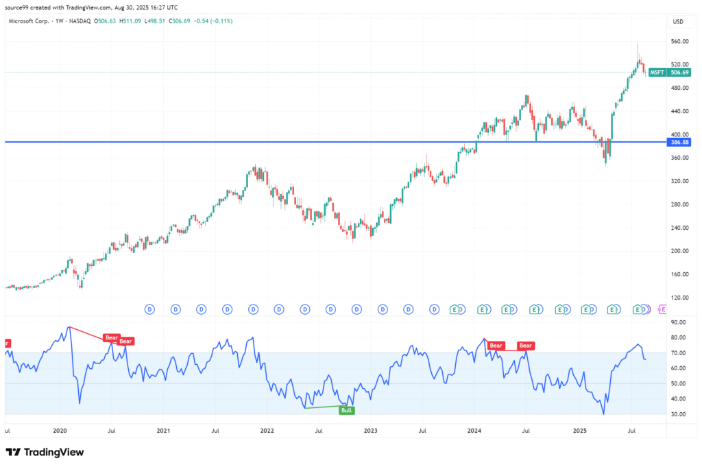
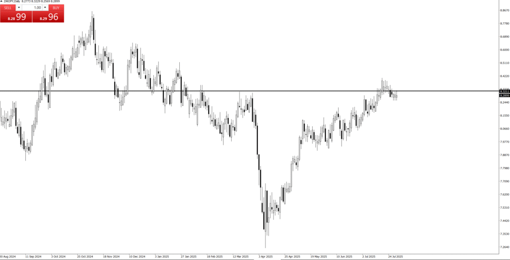
Ollie patiently opened a second chart and switched it to the Weekly timeframe. The single red candle that had terrified Chip on the 1-minute chart was invisible—just a tiny, insignificant shadow in a massive, months-long green uptrend.
The Professional’s Navigation Maps
“In trading, you need three maps to confirm your route, Chip. You are currently only using the most detailed, and therefore the most misleading, one,” Ollie explained.
1. The Monthly Chart (The Globe): “This is your big-picture context. It tells you where the market has been for years. Rule one: Never trade against the Monthly flow. If the Monthly is trending up, all your short-sell ideas are likely doomed.”
2. The Weekly Chart (The Regional Map): “This is the swing trader’s filter. It shows the major momentum and separates the real moves from the daily gossip. That single red candle you saw? On the Weekly chart, it’s just the price taking a deep breath during an expansion. It confirms the trend is still intact.”
3. The Daily Chart (The Street Map): “Only after the Monthly and Weekly charts confirm your trend do you look at the Daily. This is where you find your precise Key Level and your Pin Bar entry signal. The Daily is for execution; the Monthly and Weekly are for conviction.”
Chip sighed, leaning back as the 1-minute chart flashed green again. “So, my massive disaster was just a brief ripple on a huge ocean, and I was panicking over it.”
“Precisely,” Ollie nodded, sliding a buy order in on the Daily chart, positioned safely at a Weekly Key Level. “The excitement in professional trading isn’t in the manic speed of the small charts; it’s in the calm confidence of knowing your direction is confirmed by the grand, unhurried movements of the Monthly and Weekly flows. Trust the map, Chip, not the pothole.”